25 Things That Were Poorly Designed
Nathan Johnson
Published
08/29/2024
in
facepalm
These were some epic blunders
- List View
- Player View
- Grid View
Advertisement
-
1.
-
2.
-
3.
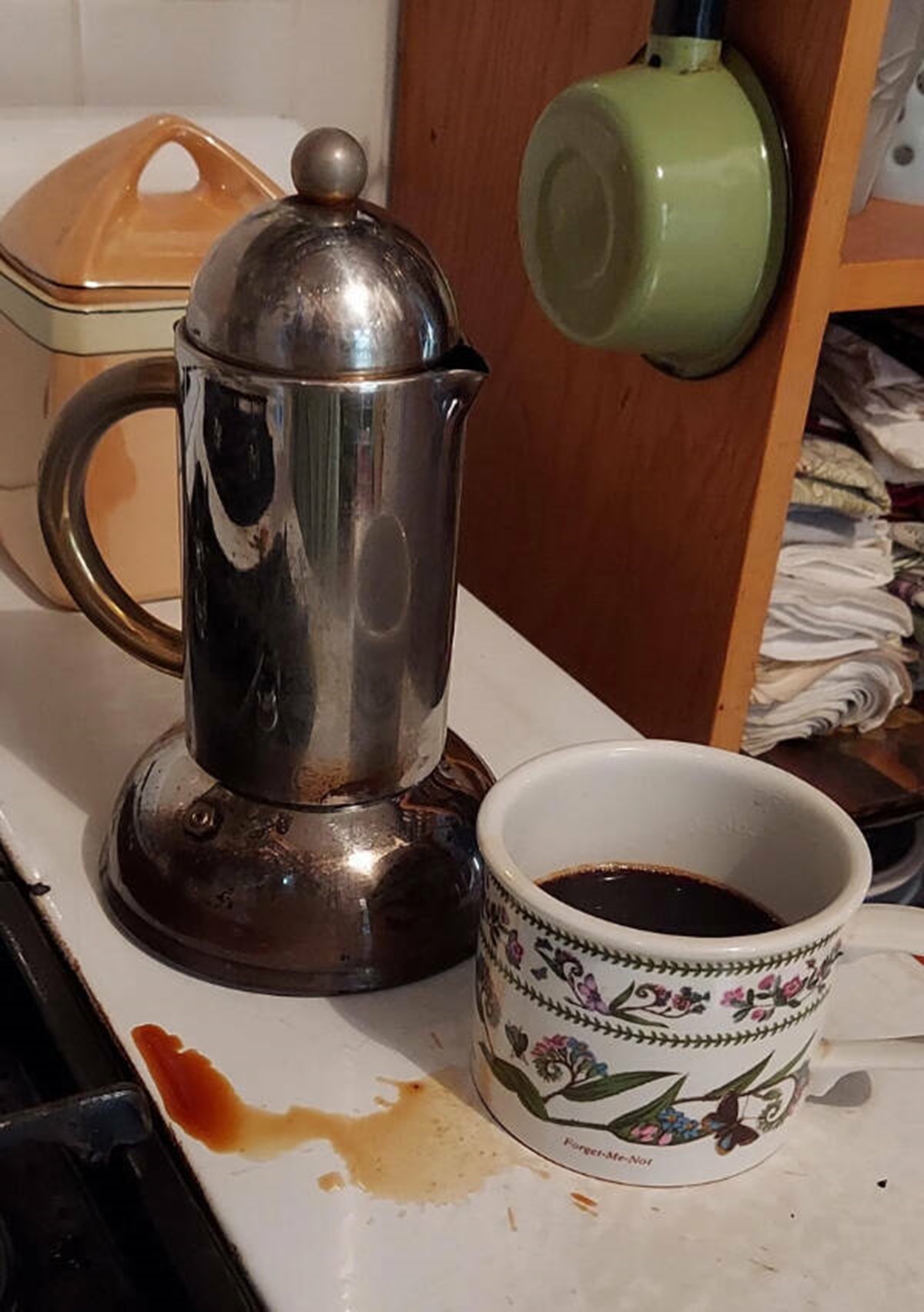 “My high-end, stylish coffeepot with the too-short spout.”
 -
4.
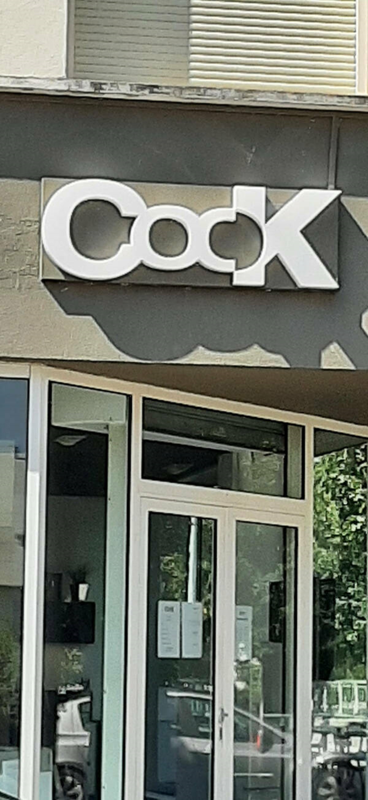 "It’s supposed to say COOK."
 -
5.
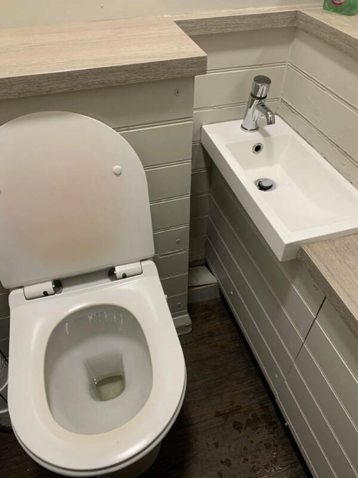 "Nothing like leaning over a toilet to use the sink."
 -
6.
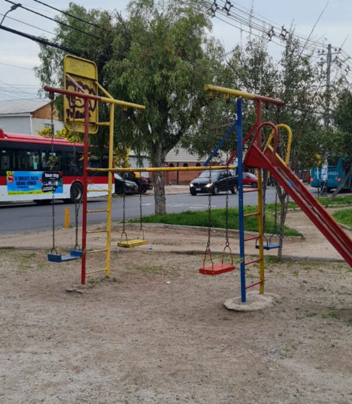 "Swings facing each other, sounds like a good idea!"
 -
7.
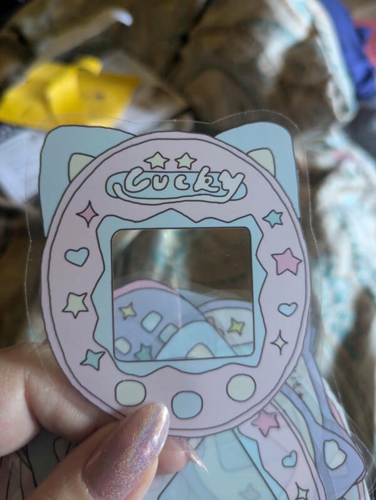 “A sticker that I hope is supposed to say “Lucky” but reads a bit differently…”
 -
8.
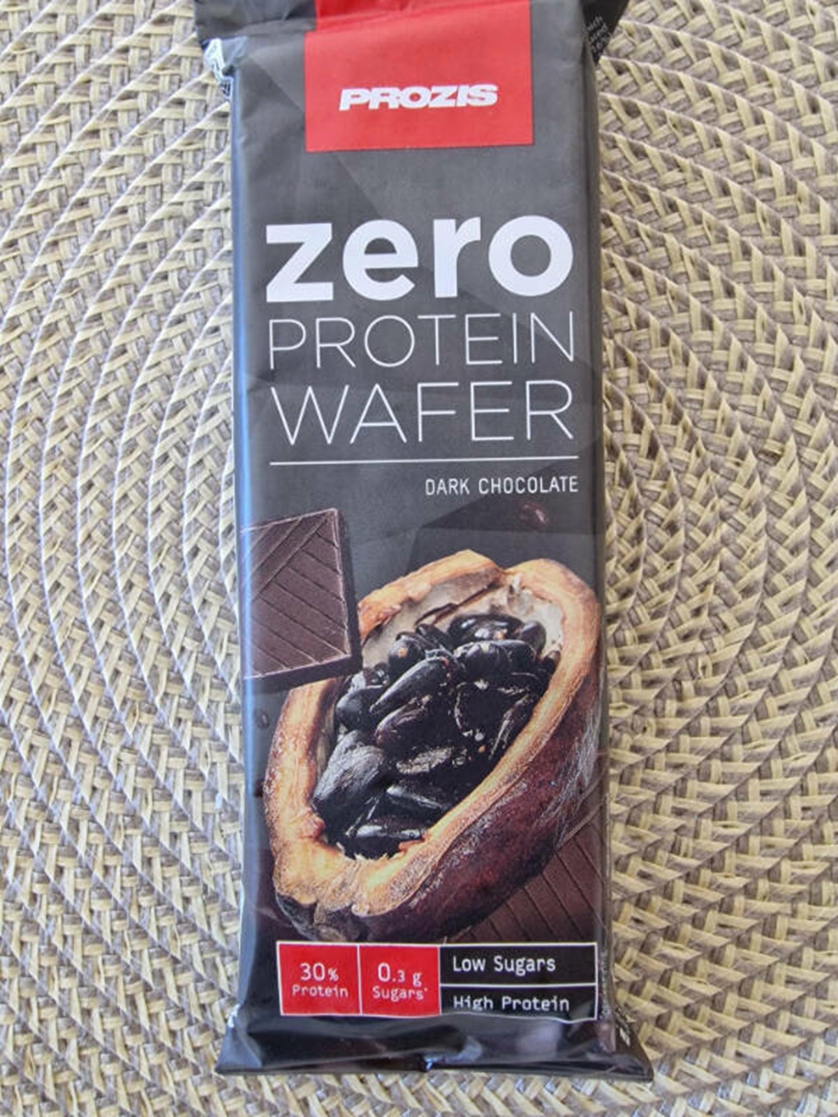 "Is it zero protein or 30 g of protein?"
 -
9.
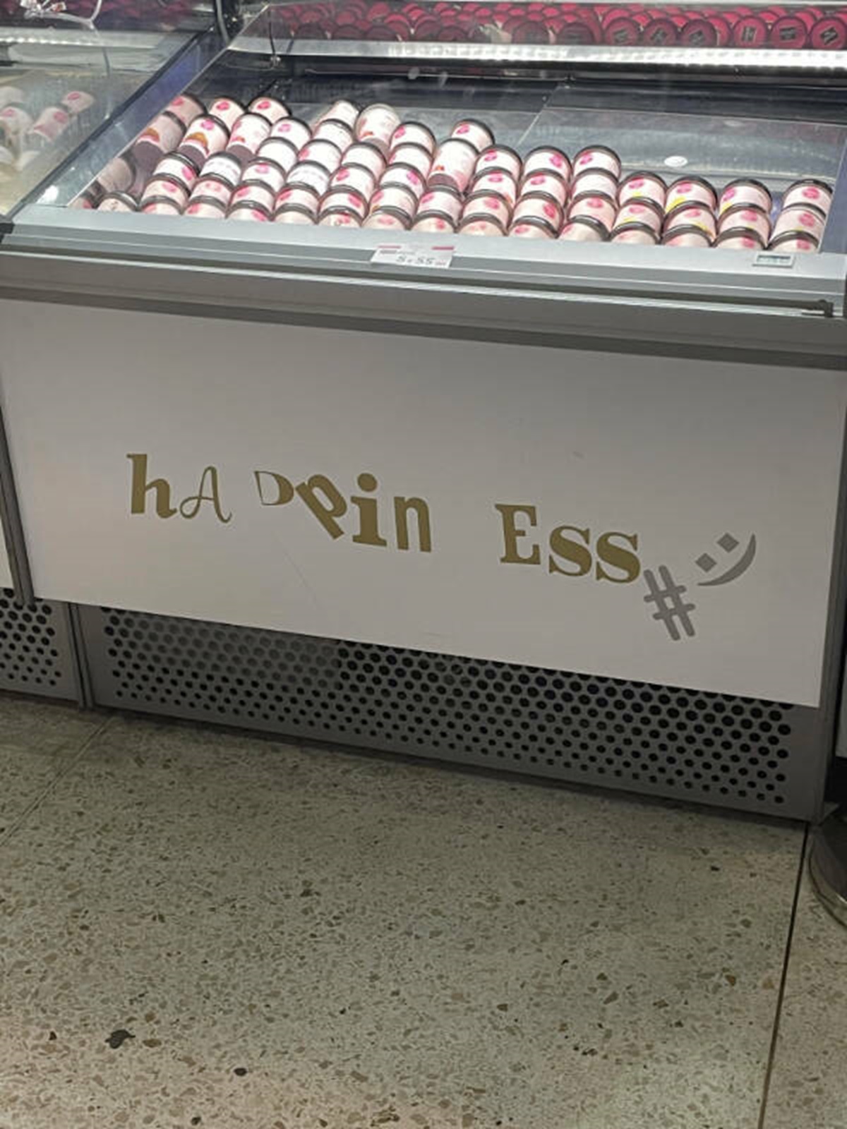 "That’s not a sign wearing away… it’s put up that way on purpose."
 -
10.
-
11.
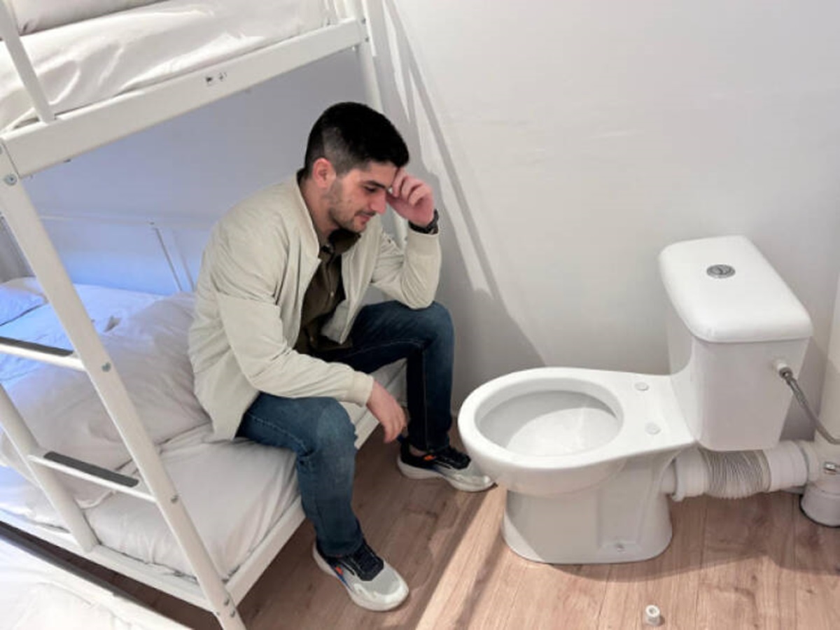 “A room I booked in Belgium.”
 -
12.
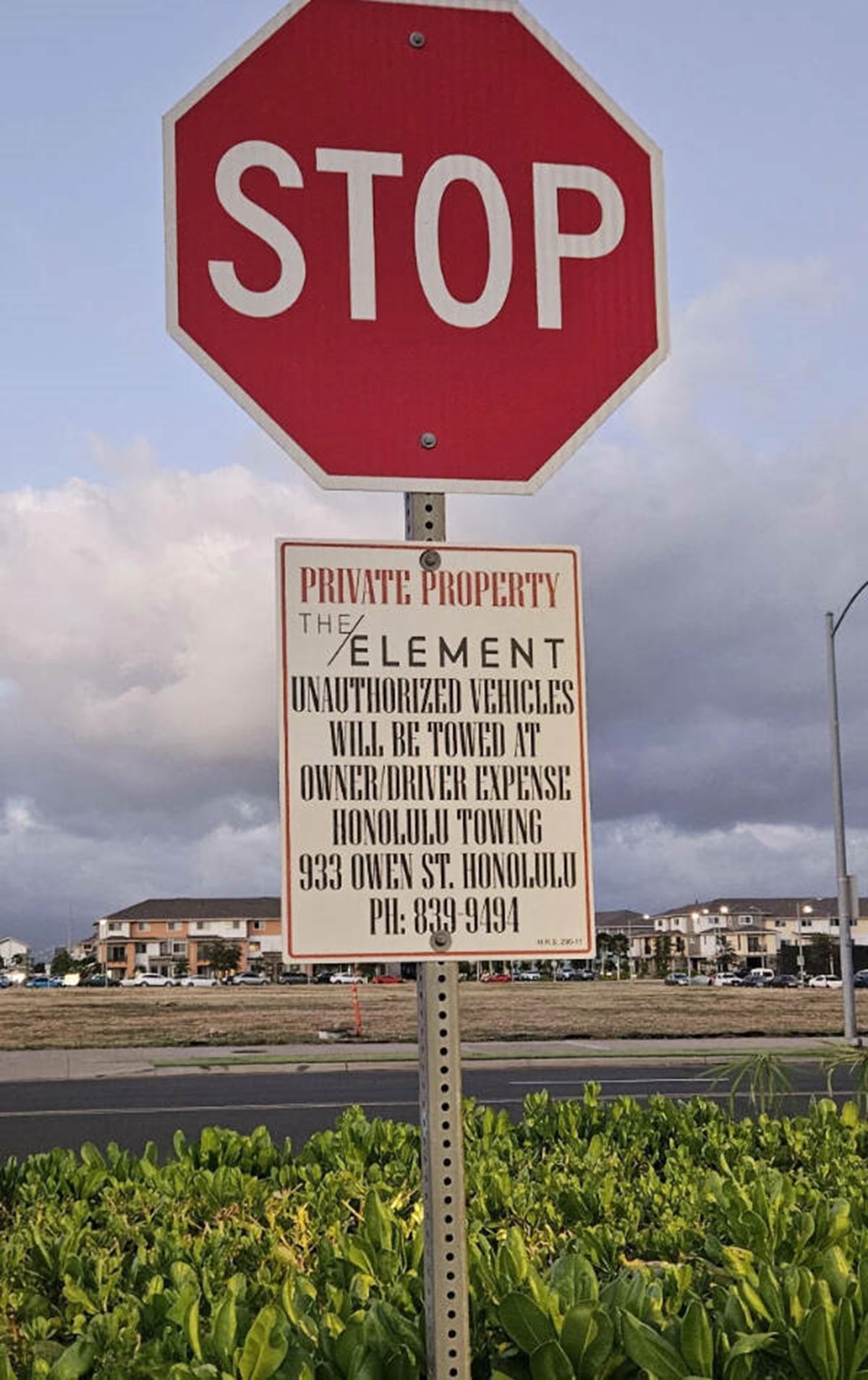 "If you need someone to stop driving to read something… maybe use a font that people can read from their car?"
 -
13.
-
14.
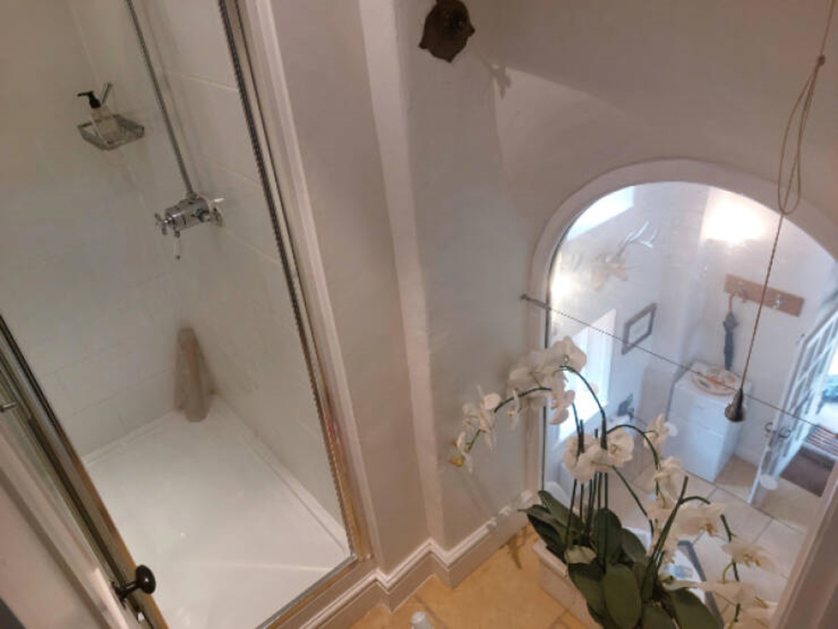 "This bathroom and shower has a big window down into the living room."
 -
15.
 "This game dev company has a very “easy to read” logo…"
 -
16.
-
17.

-
18.
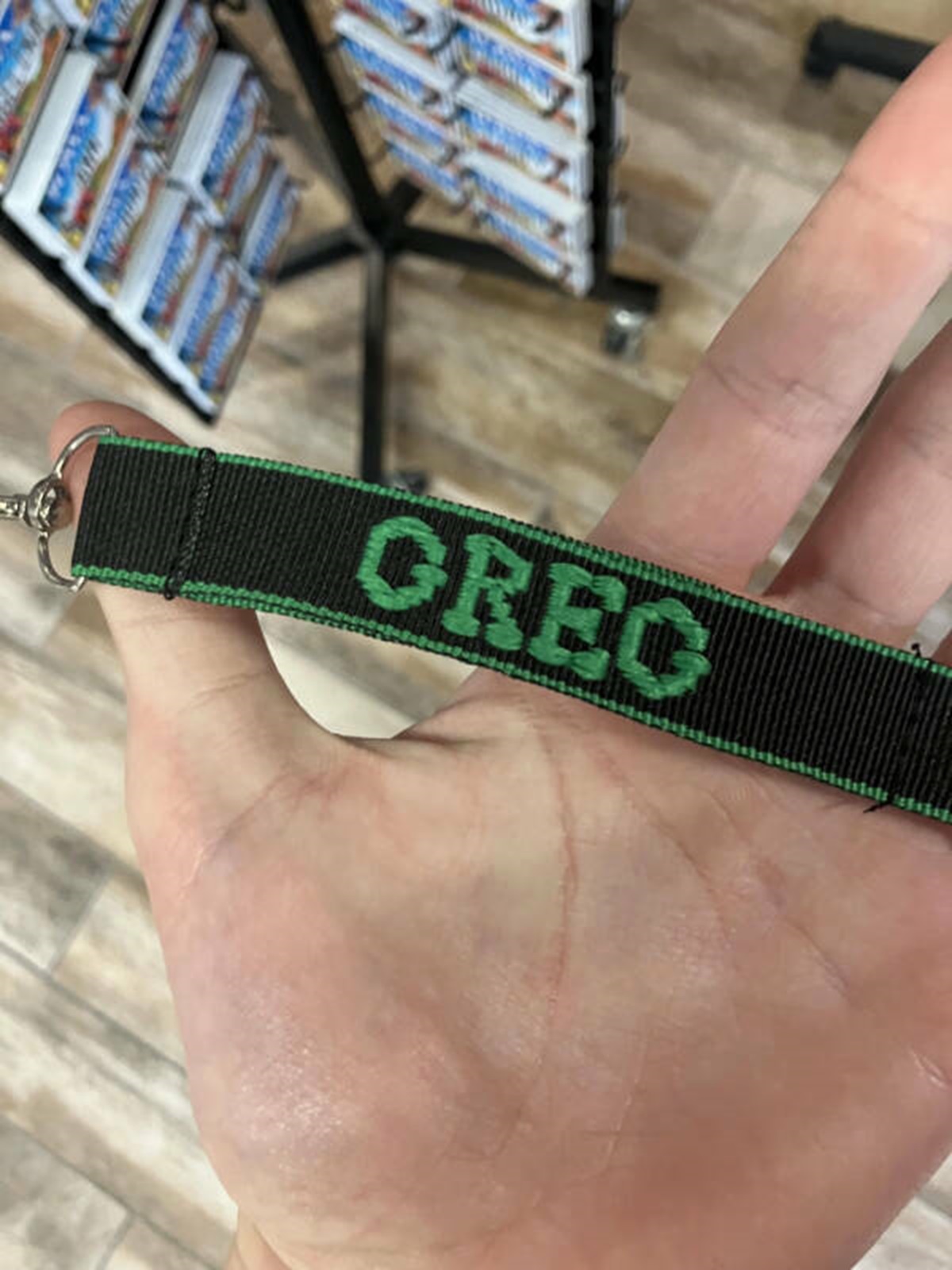 “I thought it said OREO.”
 -
19.
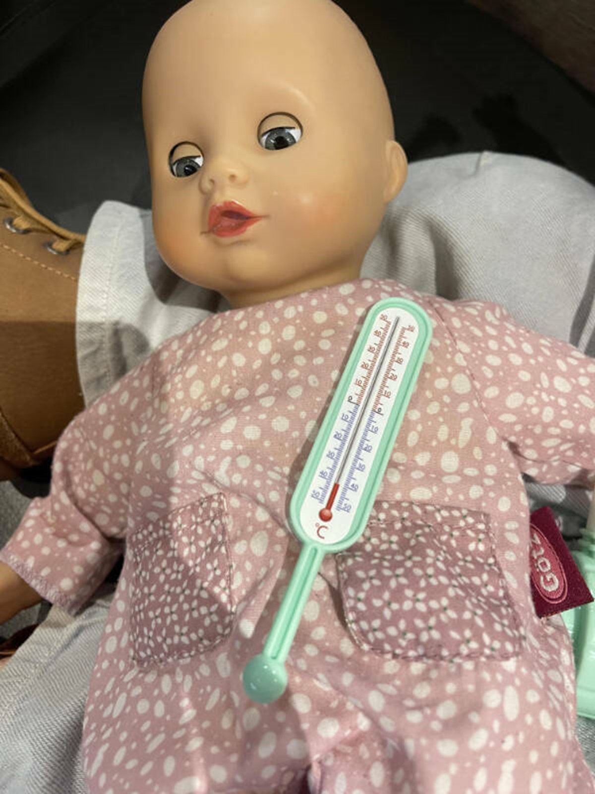 “According to this toy thermometer, my kid’s toy baby is frozen and dead.”
 -
20.
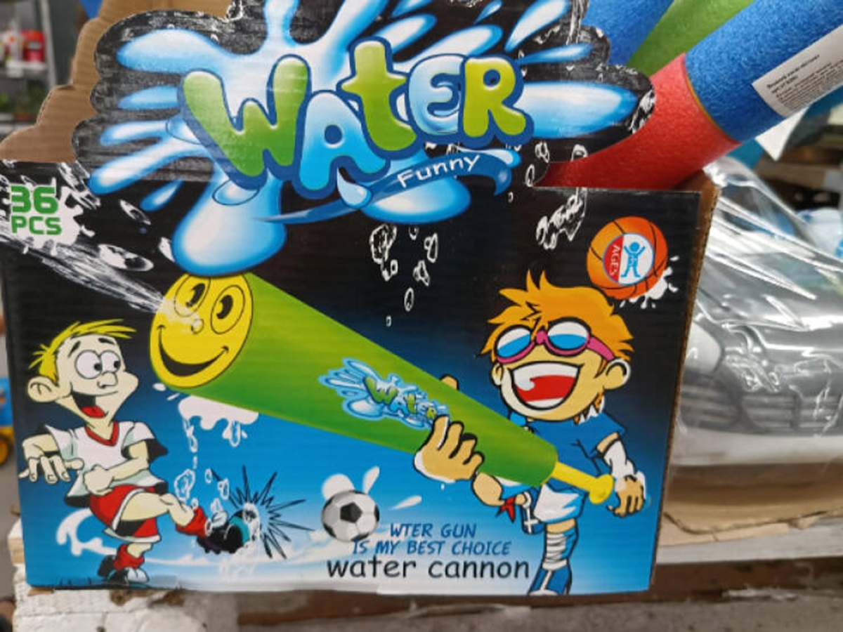 “What exactly does soccer have to do with a water cannon?”
 -
21.
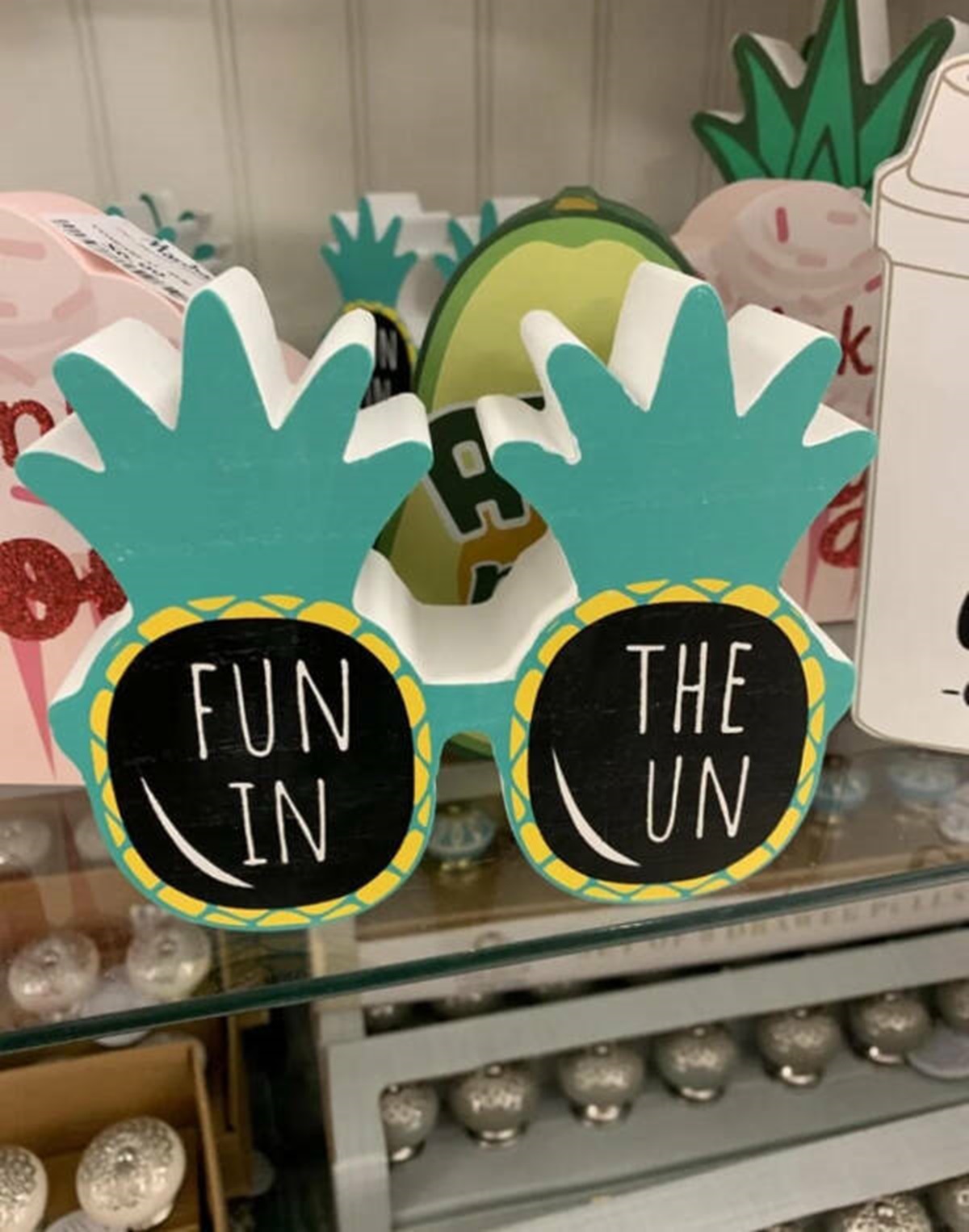
-
22.
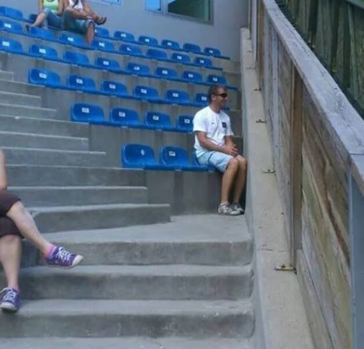
-
23.
-
24.
-
25.
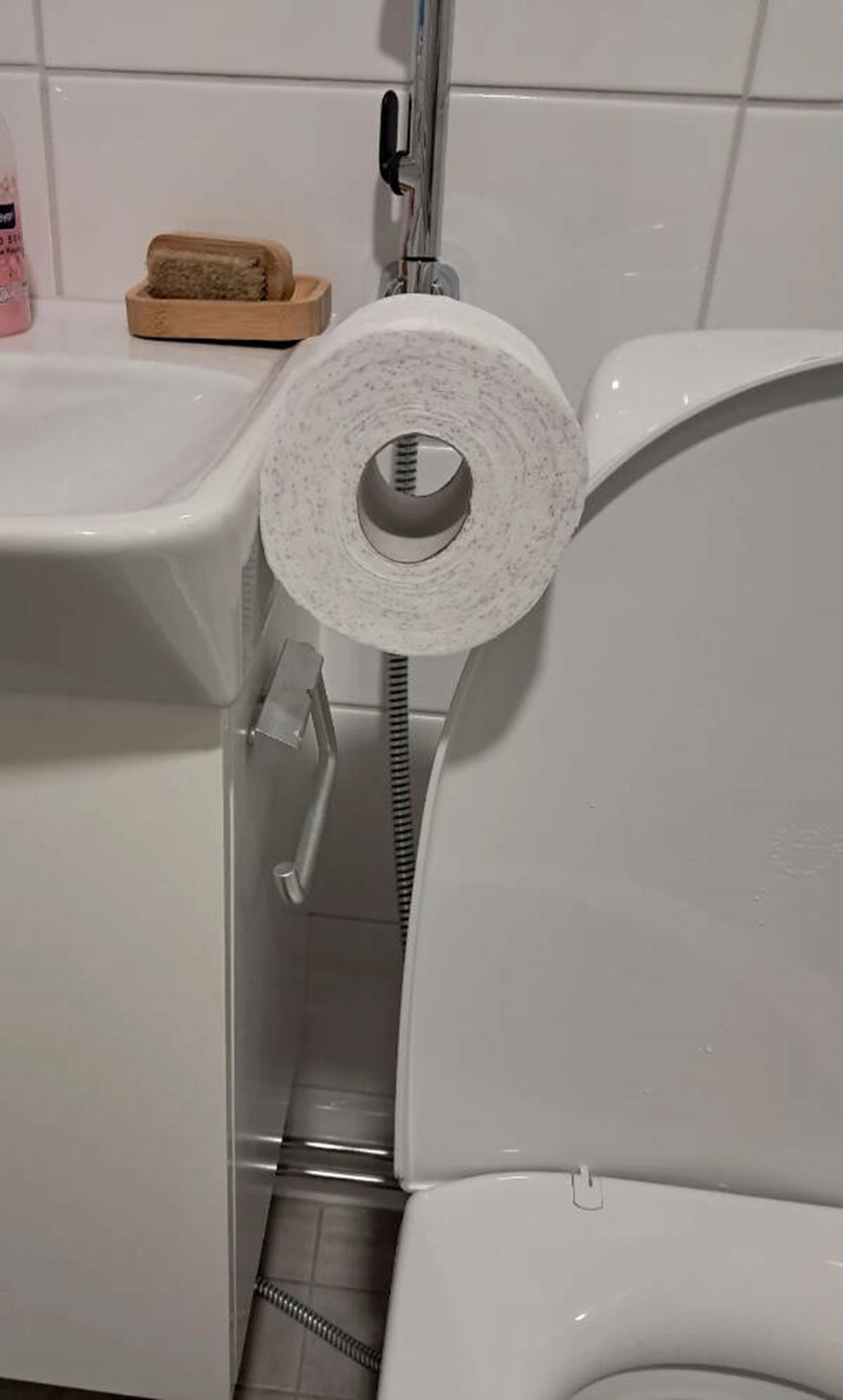 " How’s that supposed to fit?!"
- REPLAY GALLERY
-
- 25 Things That Were Poorly Designed
- NEXT GALLERY
-

- Fun Facts to Get You Over the Hump
25/25
1/25
Categories:
Facepalm




0 Comments